


MANNOVER
How We Proved That B2B Can Be Bold, Fresh, and Unapologetically Modern

A Fresh Wind in a Blue Ocean
The water industry has a visual identity problem. Blue dominates. Layouts are safe. Communication is technical and dry. And while the engineering behind the scenes is often remarkable, the brands rarely reflect that ambition.
Mannover was built to challenge that.
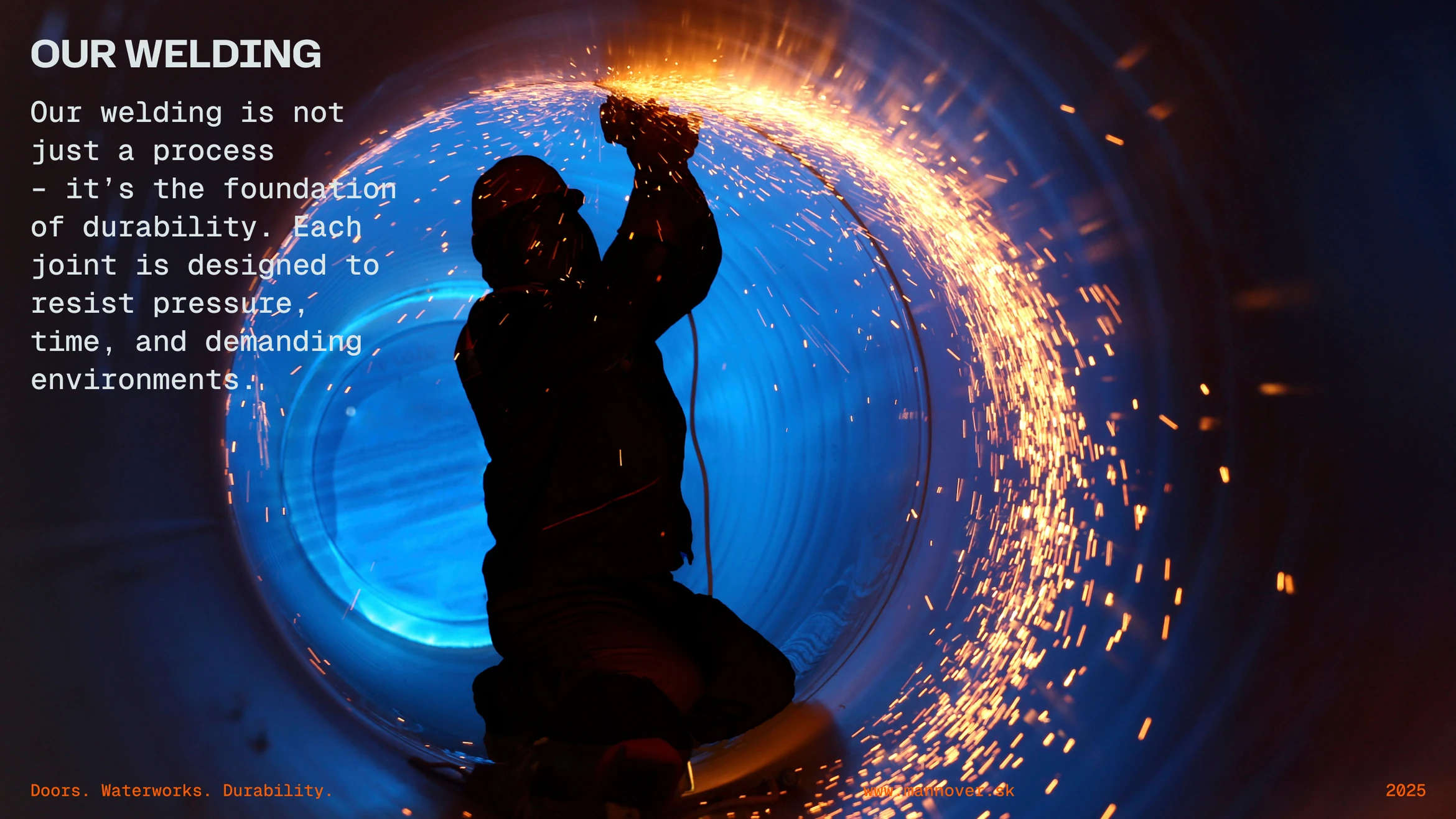
Bold Brands Belong in B2B Too
Mannover doesn't fit neatly into one box — and that's exactly the point. This Slovak company operates across construction works in water management facilities, from reservoirs and pumping stations to drinking water treatment plants, while also designing, manufacturing, and installing their own stainless steel doors. Two industries, one company, one clear ambition: to take their flagship product to a wider commercial market and make it impossible to ignore.
When they came to us, they already knew what they wanted. A brand with edge. Modern, confident, a little rebellious — one that would finally reflect the quality and precision they deliver every single day on site.
The creative concept Doors & Waterworks captures the company's dual identity. It rhymes. It describes. It sticks. In one phrase, it communicates both what Mannover builds and where they build it.
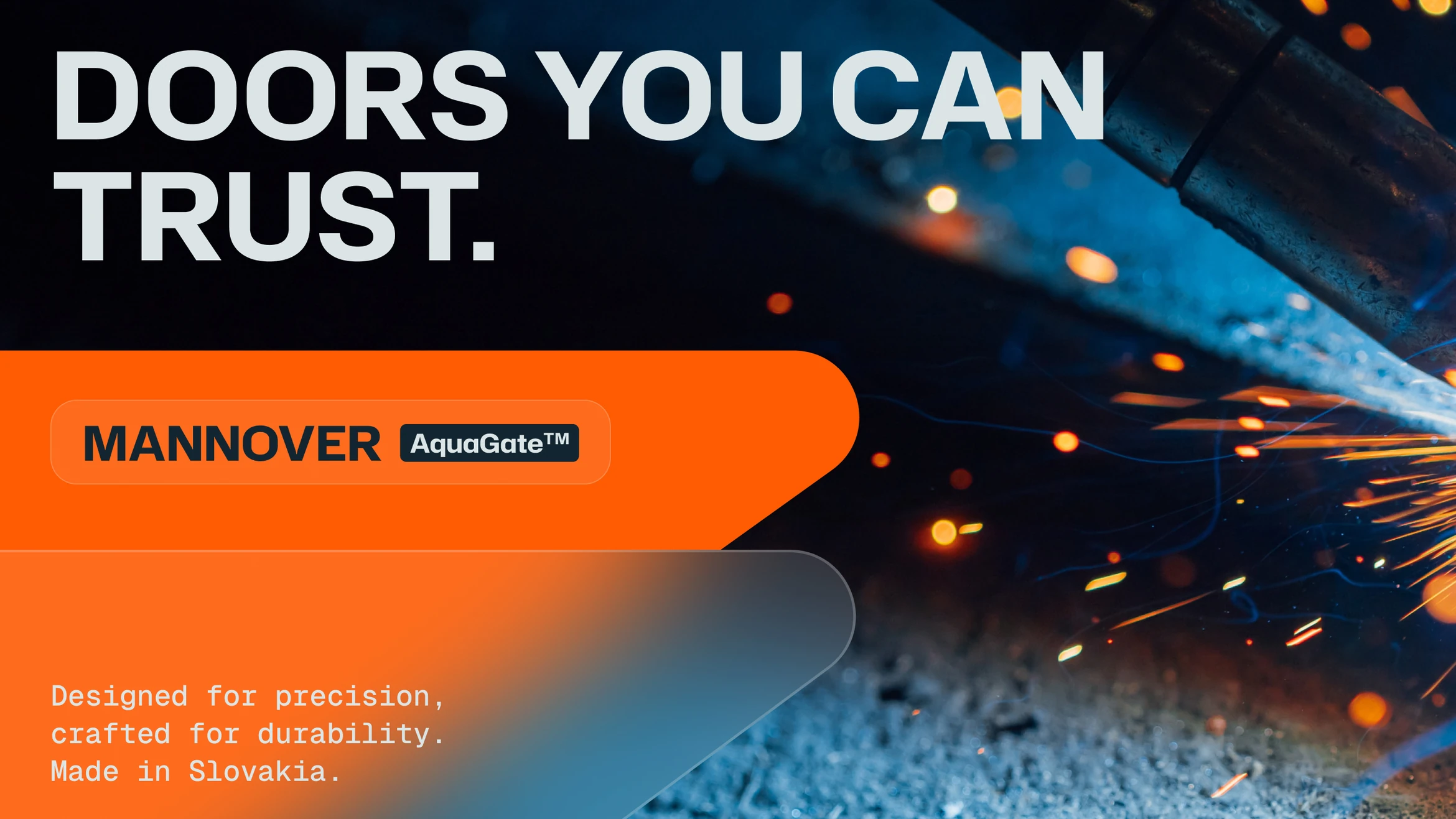

Built for Durability
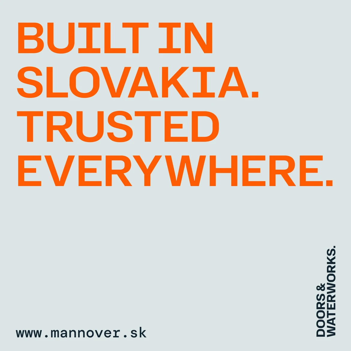
Every element of the verbal identity was built around a single word: durability — the defining USP of Mannover's products. The communication claims reflect this with precision — thorough technical work and resilient solutions built to outlast generations, structures designed to endure, and a standard of accuracy that clients can rely on without question.
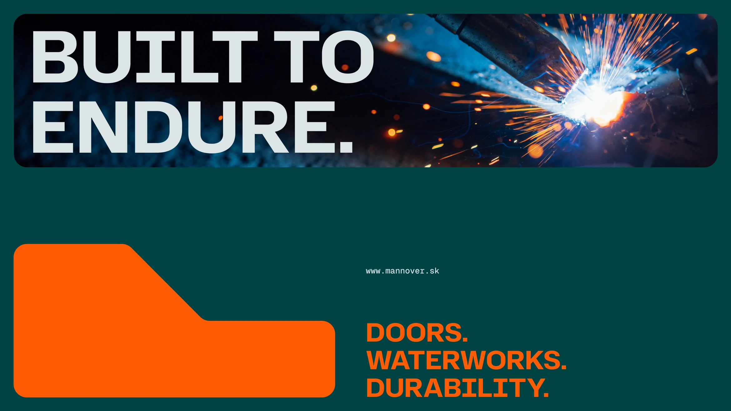
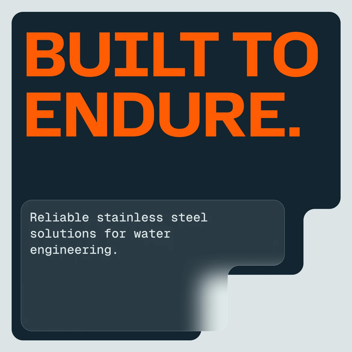

Design that Dares
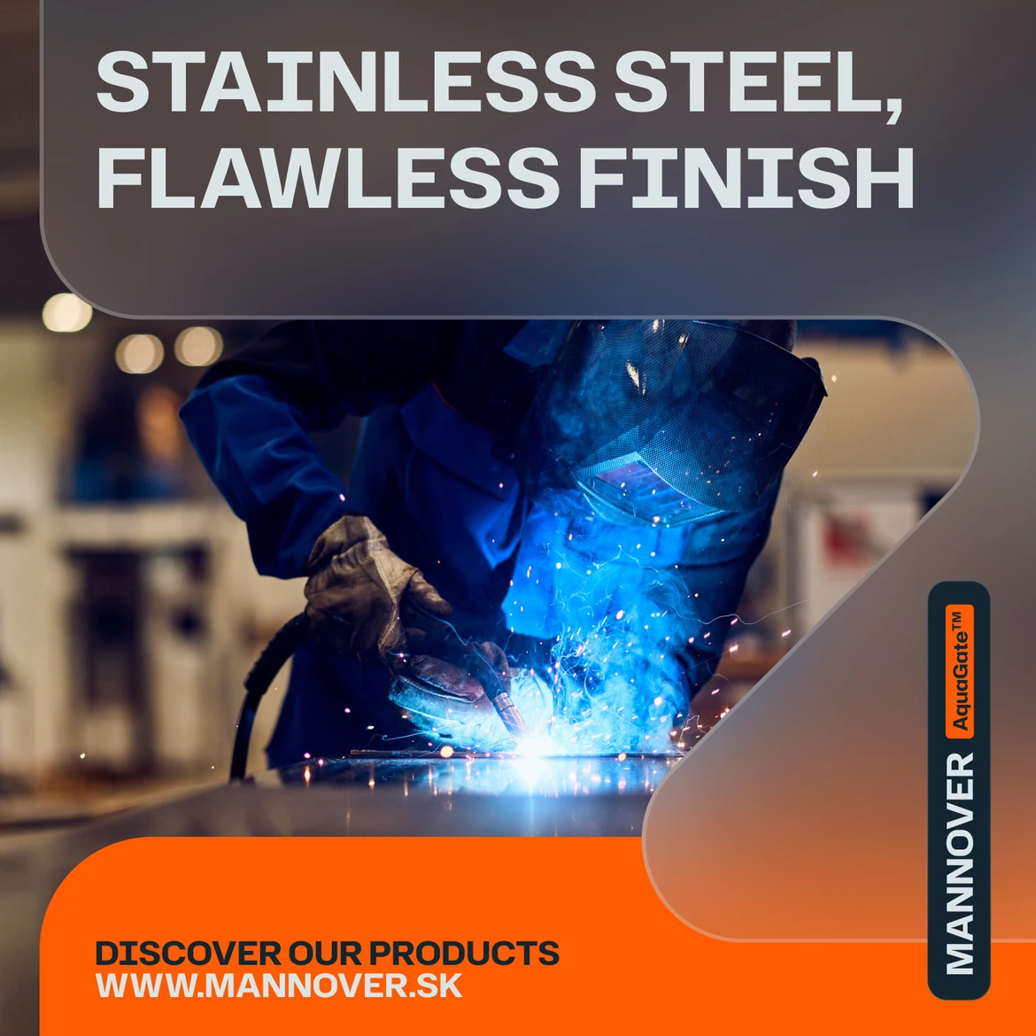
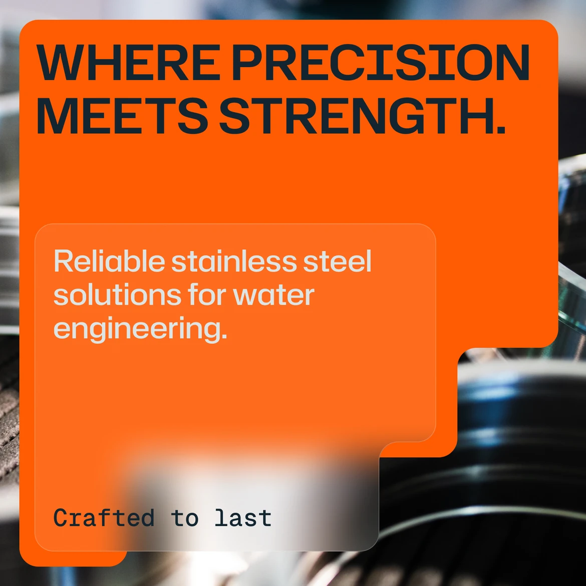
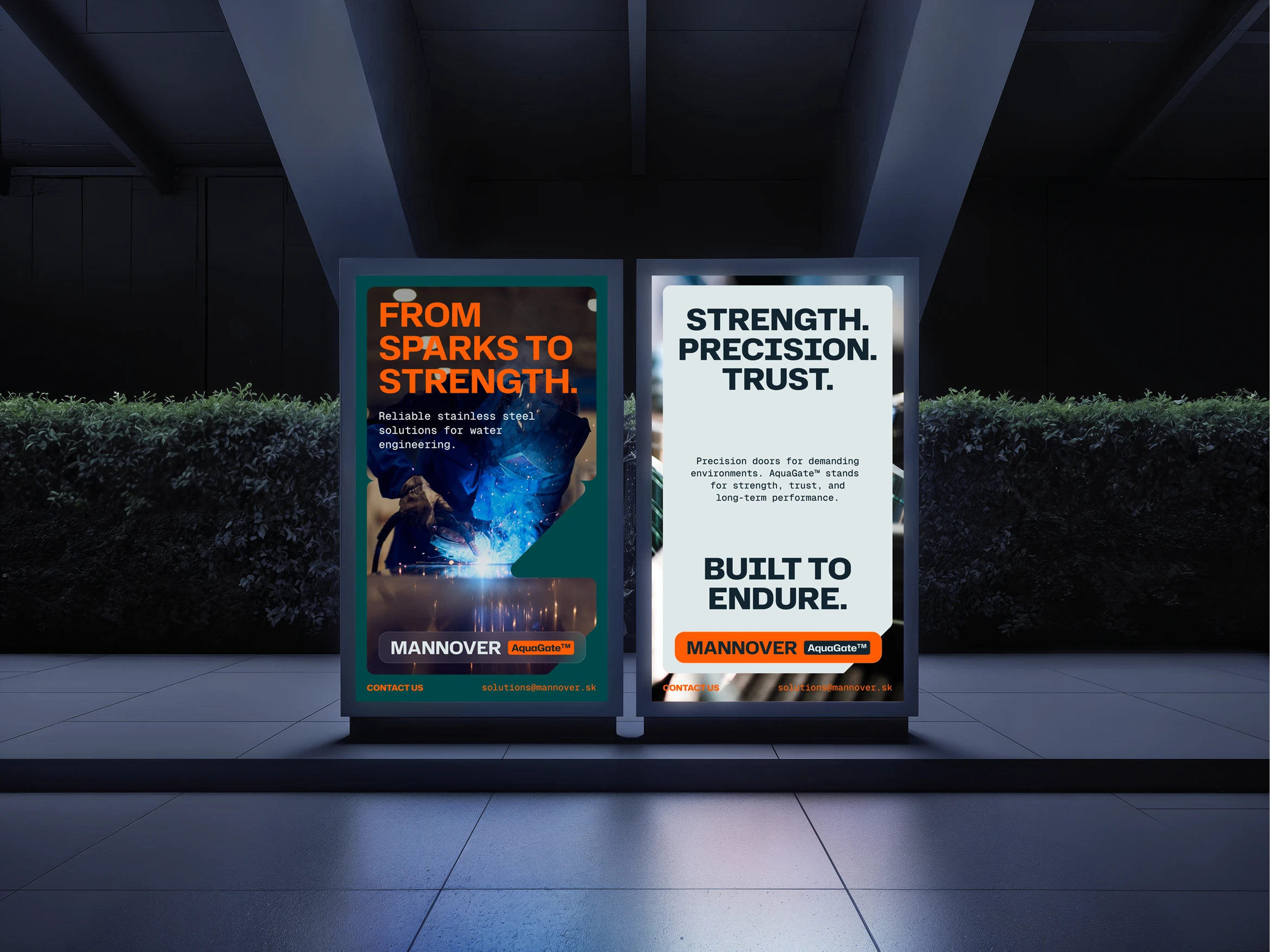
The visual identity draws from the visual language of modern commercial design — the kind you'd expect from a premium industrial brand, not a regional construction and manufacturing firm. That contrast is intentional. The primary audience — technical decision-makers, procurement managers, and project engineers, predominantly men in their 40s and 50s — expects professionalism. What they don't expect is a brand this sharp.

From Strategy to Execution
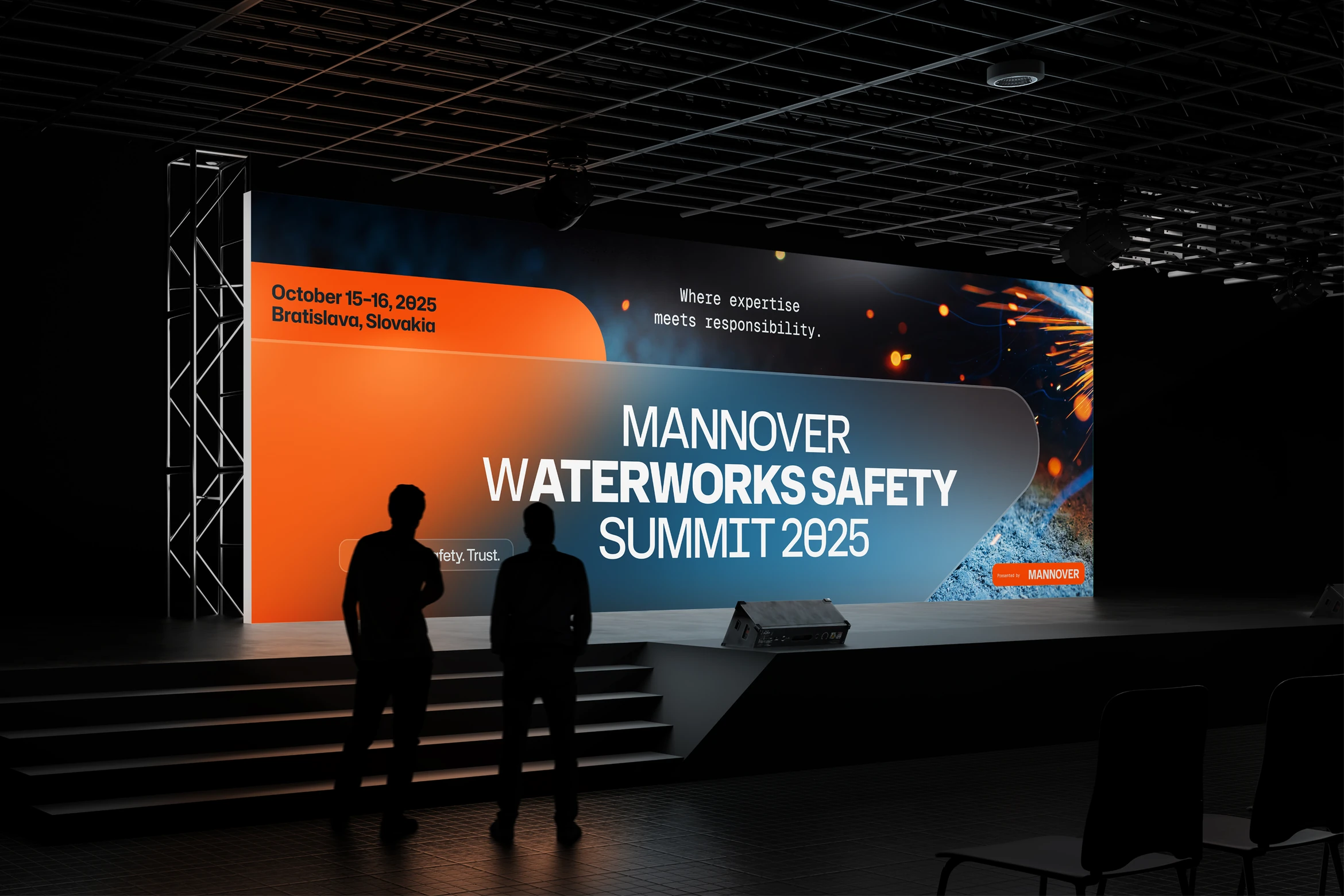
The brand identity was developed into a comprehensive set of deliverables, giving Mannover's marketing and sales teams everything they need to go to market immediately — both online and offline.
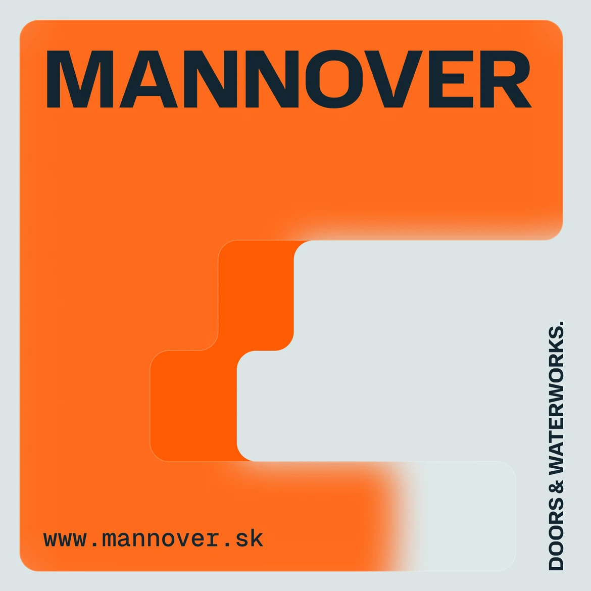
The full brand package included a complete B2B Visual Identity covering logo and its variations, brand colors, typography system, brand assets and their variations, backgrounds and textures, curated photography selection, and a visual system that brings all brand elements together into a coherent whole. The brand manual documents every element for consistent long-term use.

B2B Print & Digital Collateral
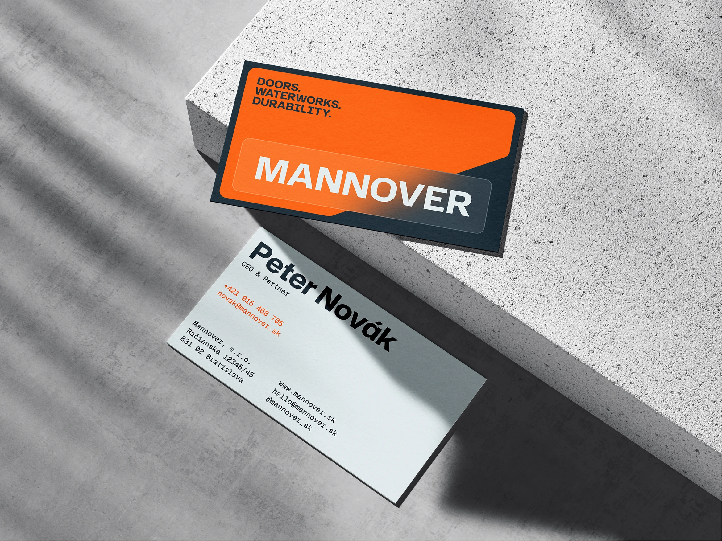
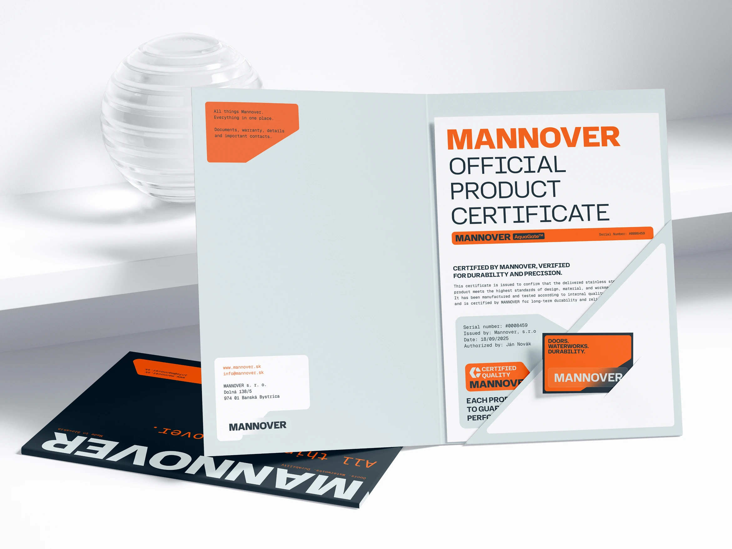
On the implementation side, we delivered letterhead, printed business cards, a coded email signature, a price proposal template, a product handover certificate, a document folder, a company sales presentation, a LinkedIn banner, and 20 LinkedIn post templates ready for immediate use. All print materials were delivered in print-ready files, and all digital outputs in fully editable formats. Every single component was handed over in both Slovak and English — ready to use across markets from day one.
Mannover left with a complete brand — not a starting point, but a finished toolkit built for a company that means business.

A Website You Don't Expect
In the water and construction industry, a website that genuinely surprises its visitors is rare. The MANNOVER website was built to be exactly that — a digital presence that commands attention from the first scroll, communicates credibility instantly, and leaves no doubt that this is a company operating at a different level. For many industry visitors, it will be the first time they see their sector represented with this kind of visual ambition.

Ready to elevate your brand to a world-class level?
Contact us for BRANDING or REBRANDING.

