")

How We Created a Brand for an Ambitious Innovator in the Pumping Industry
SPIRAM PUMPS

")
The Rise of a New Brand
We first met this talented team of young researchers at a time when their work existed only as years of dedicated R&D, with no commercial concept yet in place. They had developed a new generation of screw centrifugal pumps and aspired to enter a market long shaped by established manufacturers such as Hidrostal, KSB, or Flygt. To approach the global market, however, they needed a brand — one that would be bold, distinctive, and executed with world-class precision.

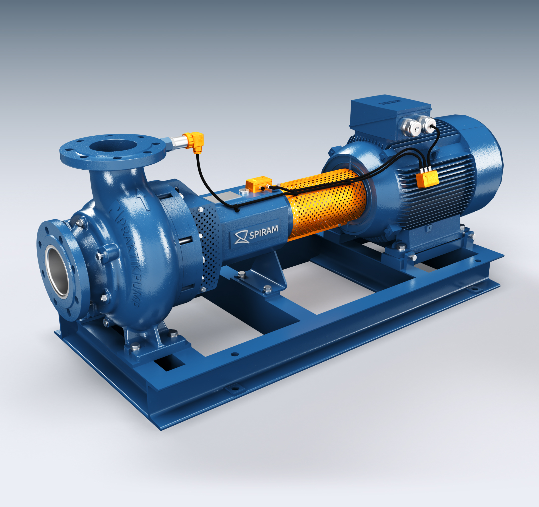
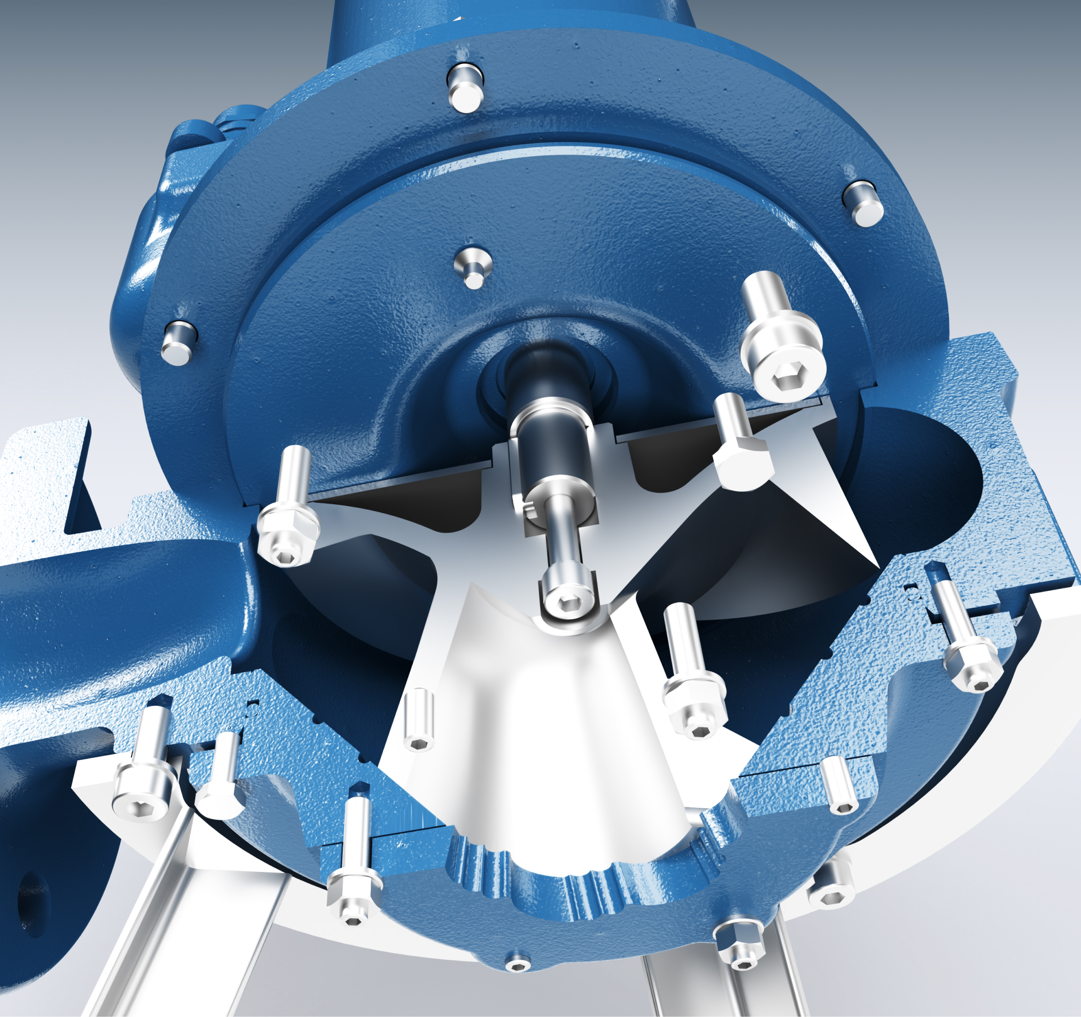
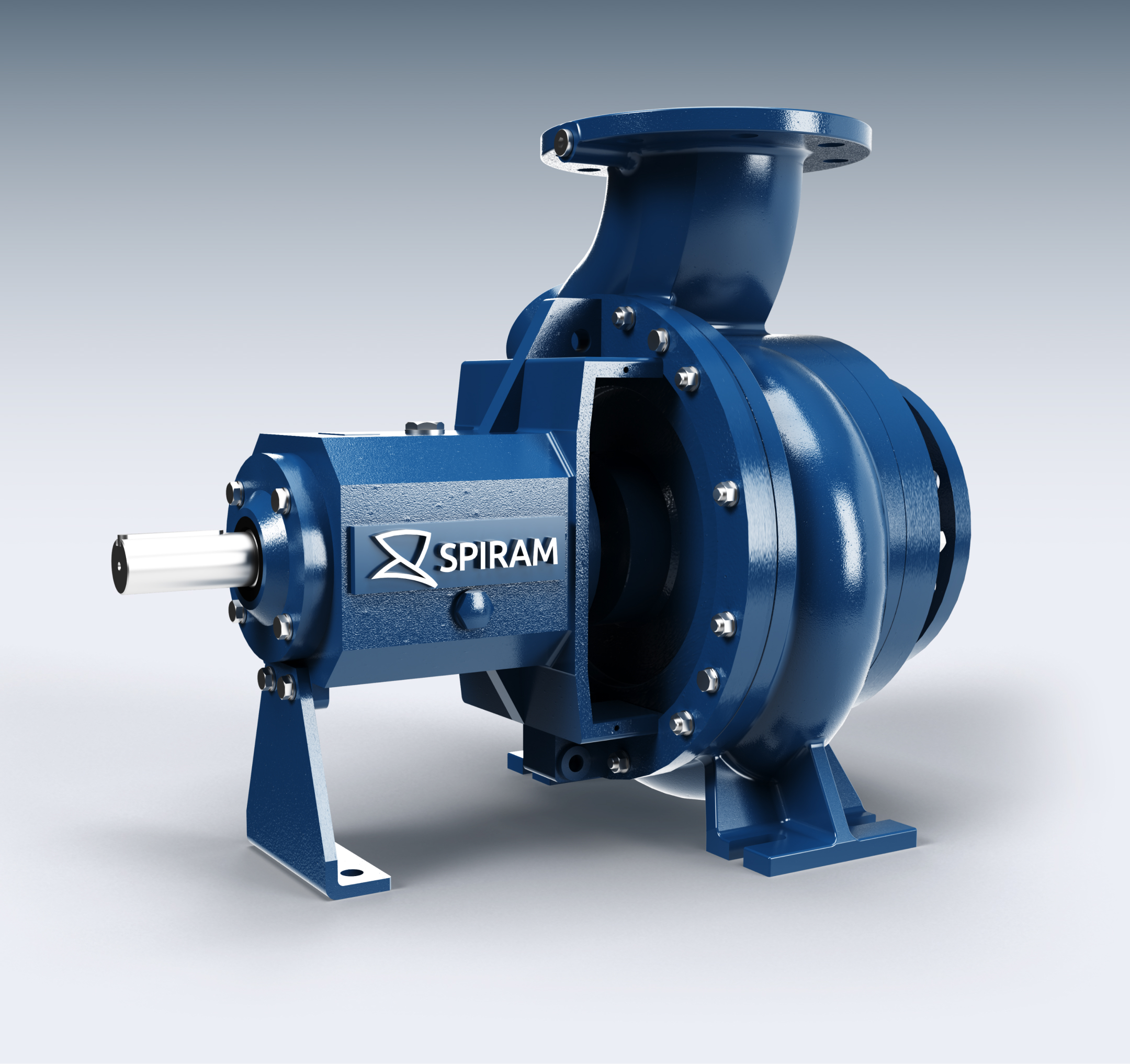
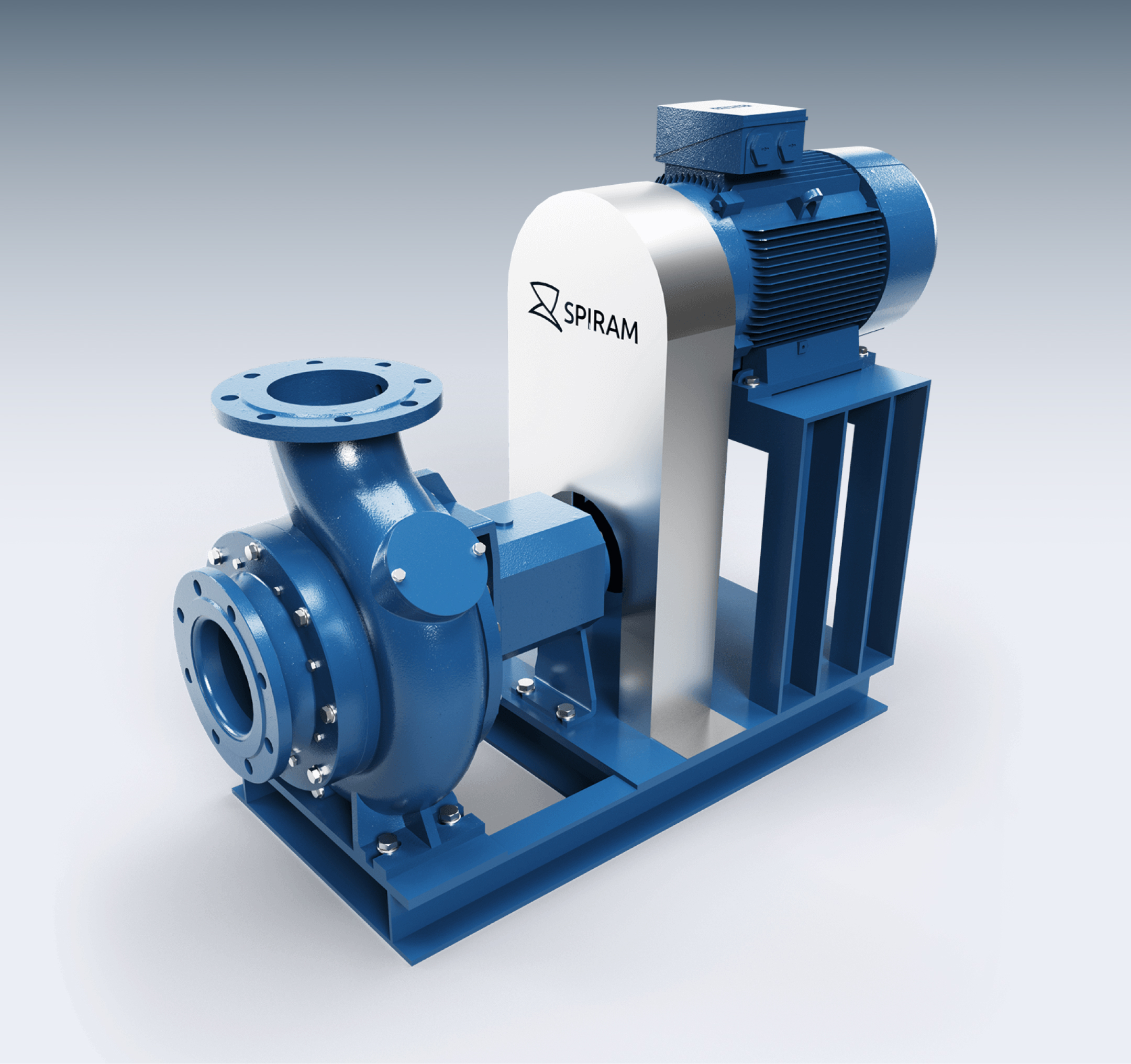
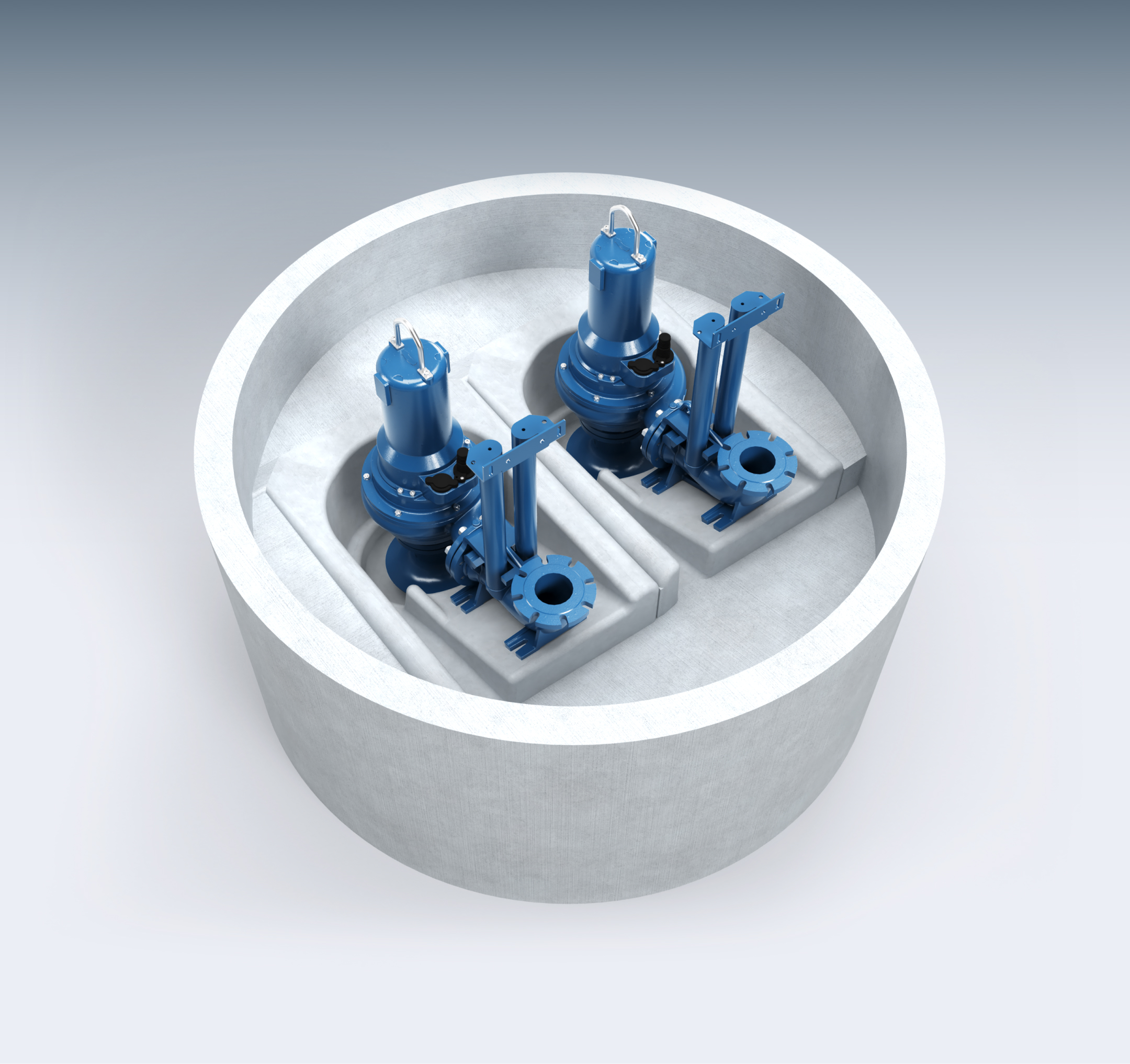
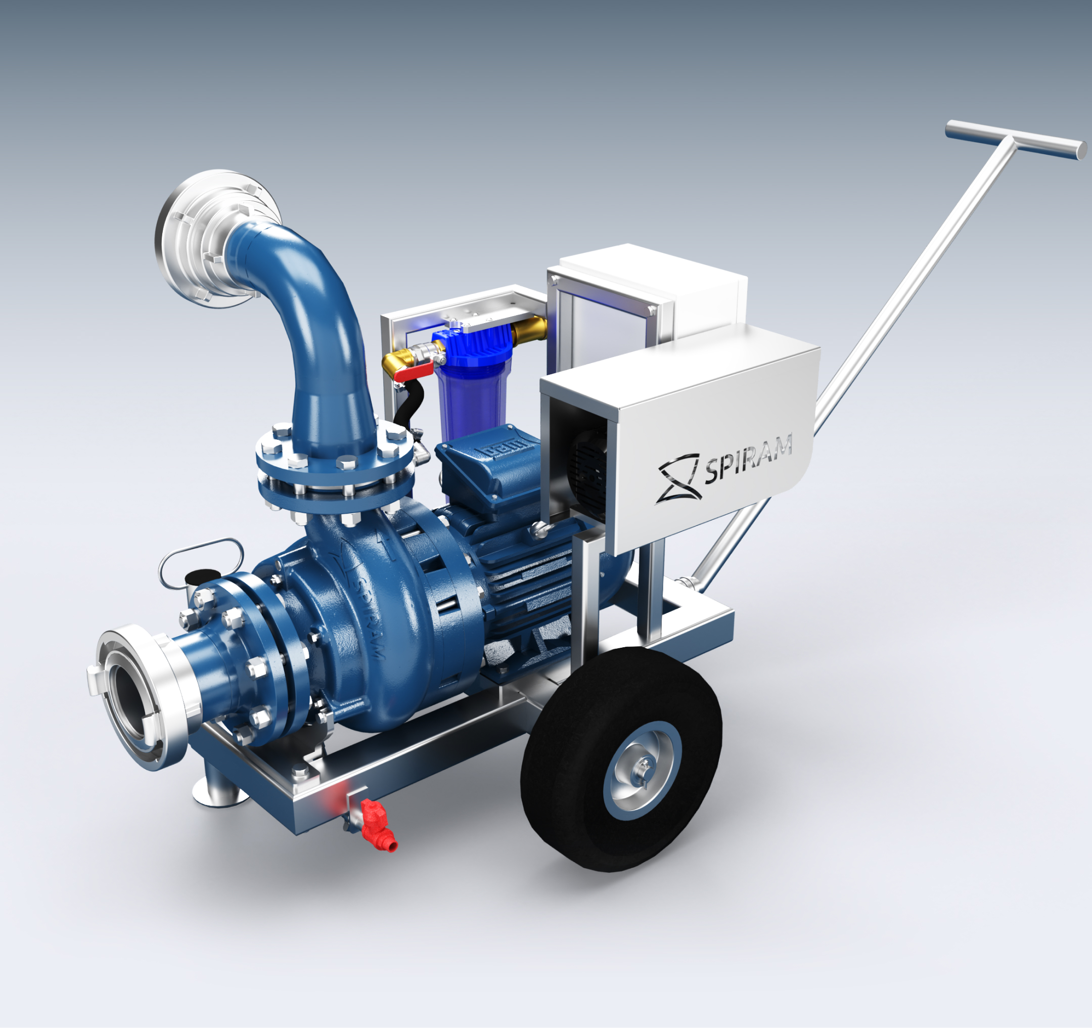
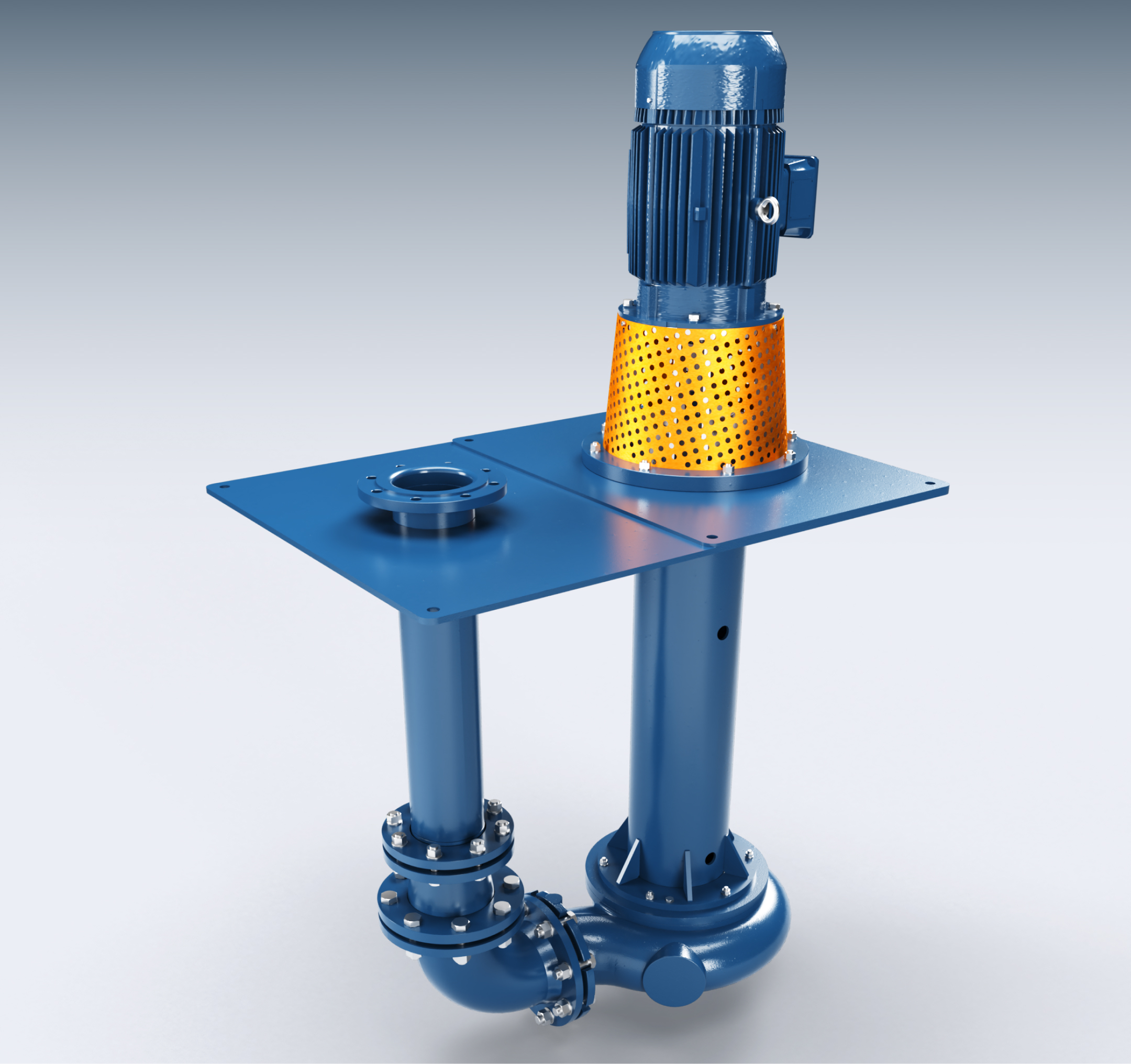
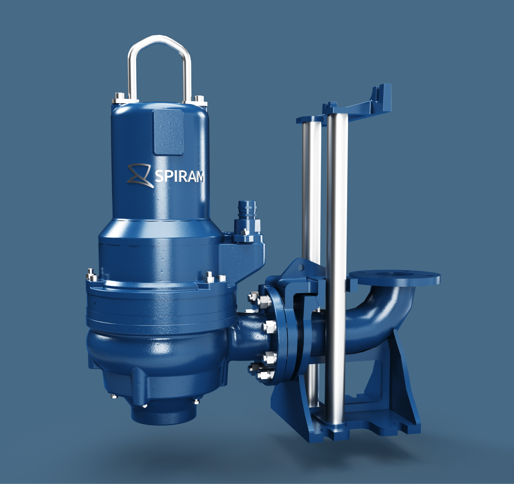
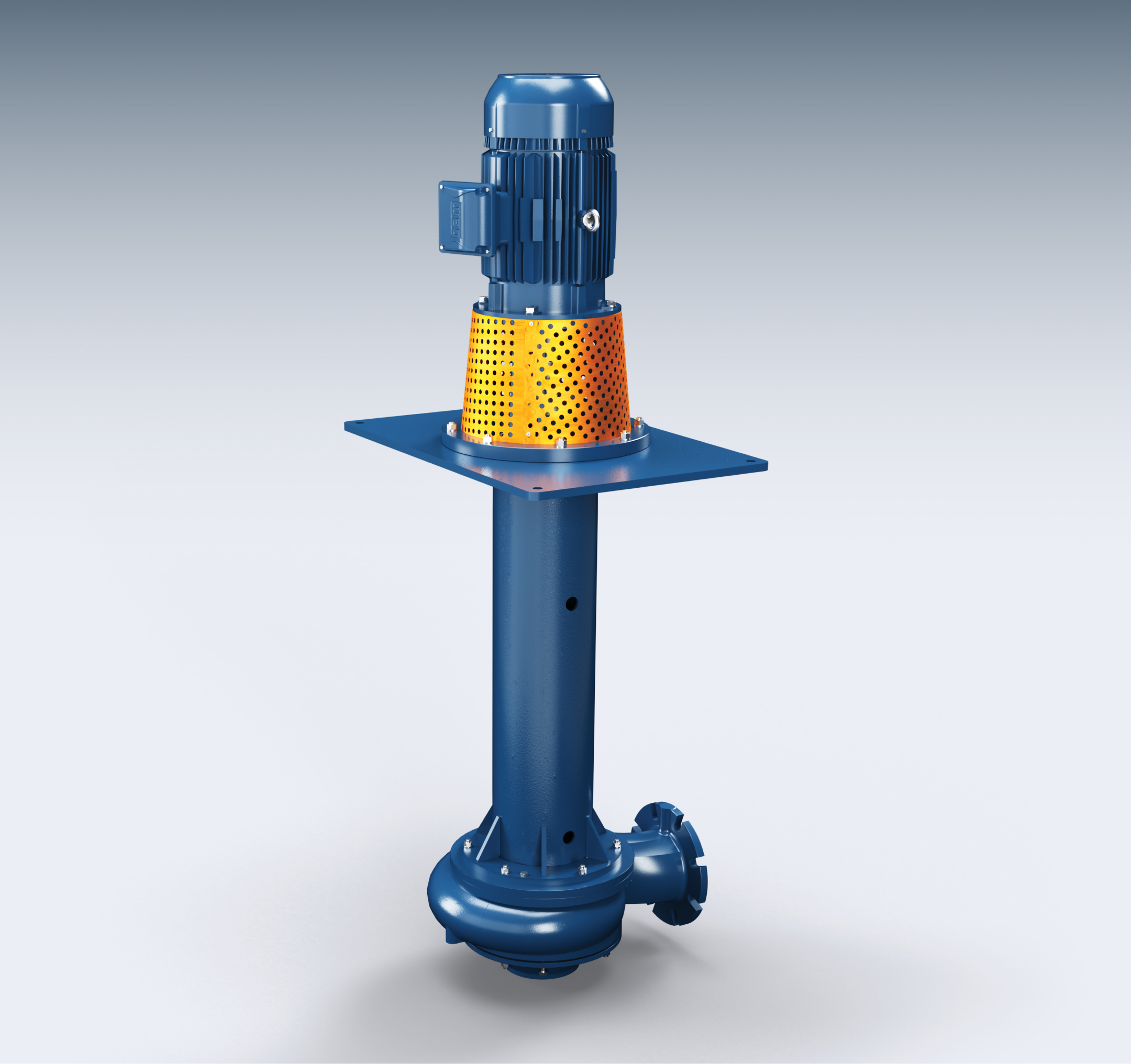
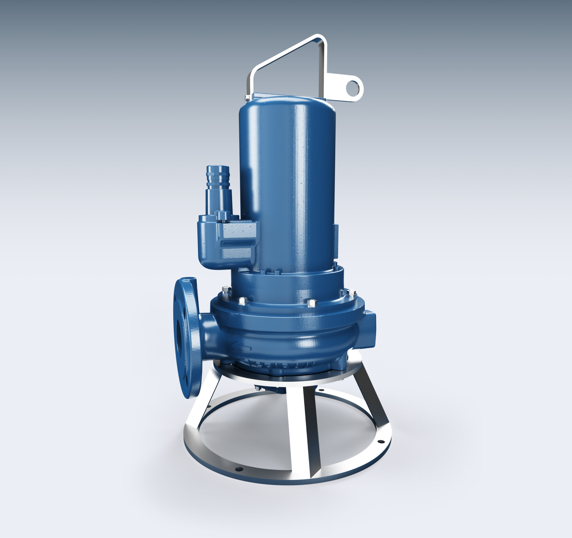
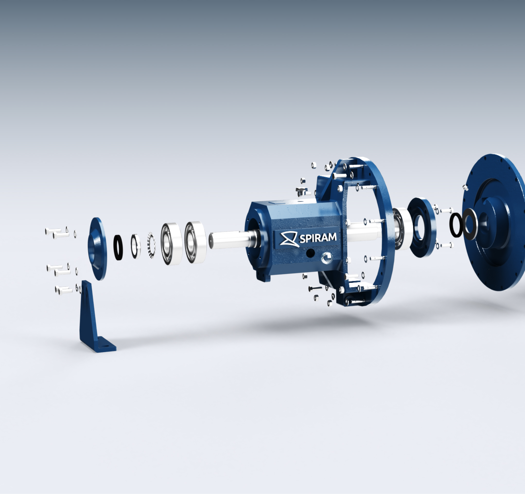
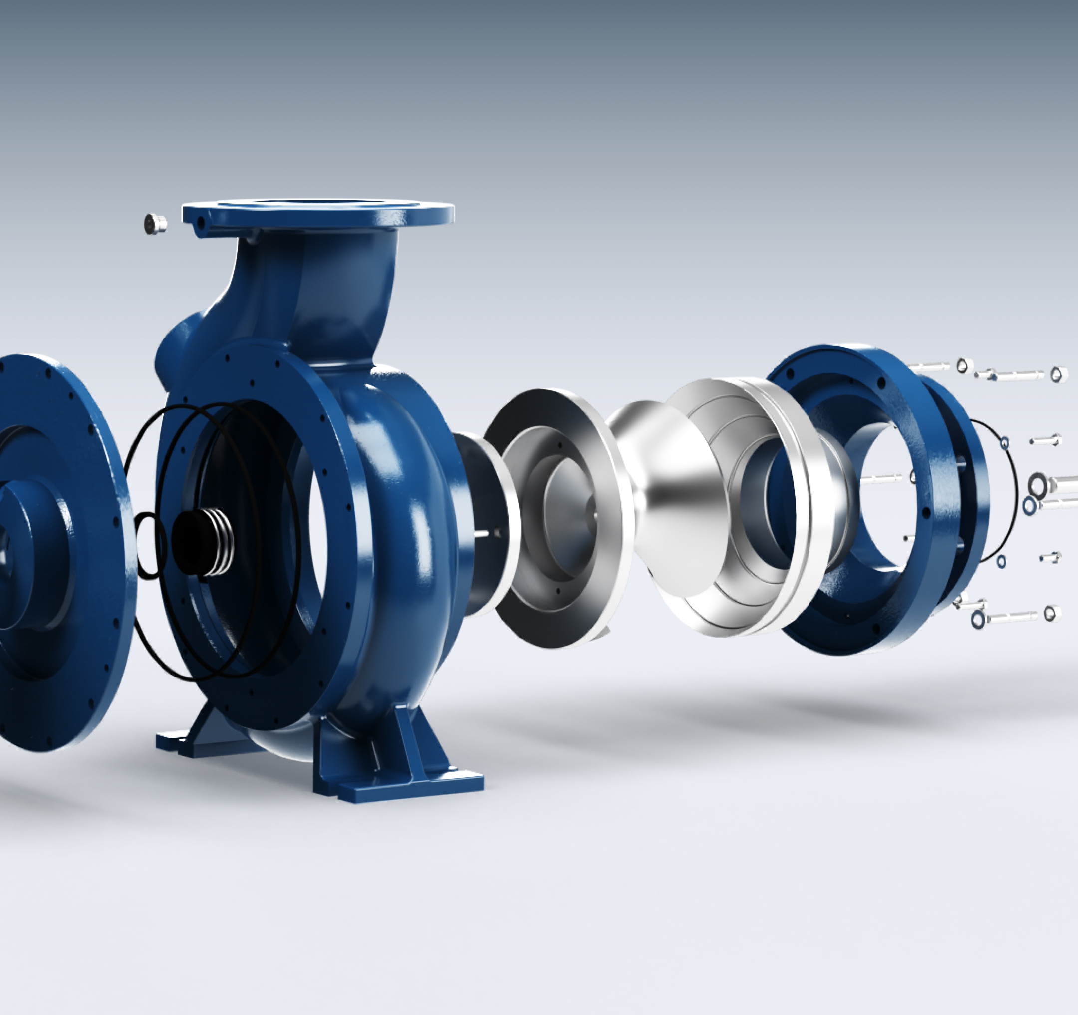
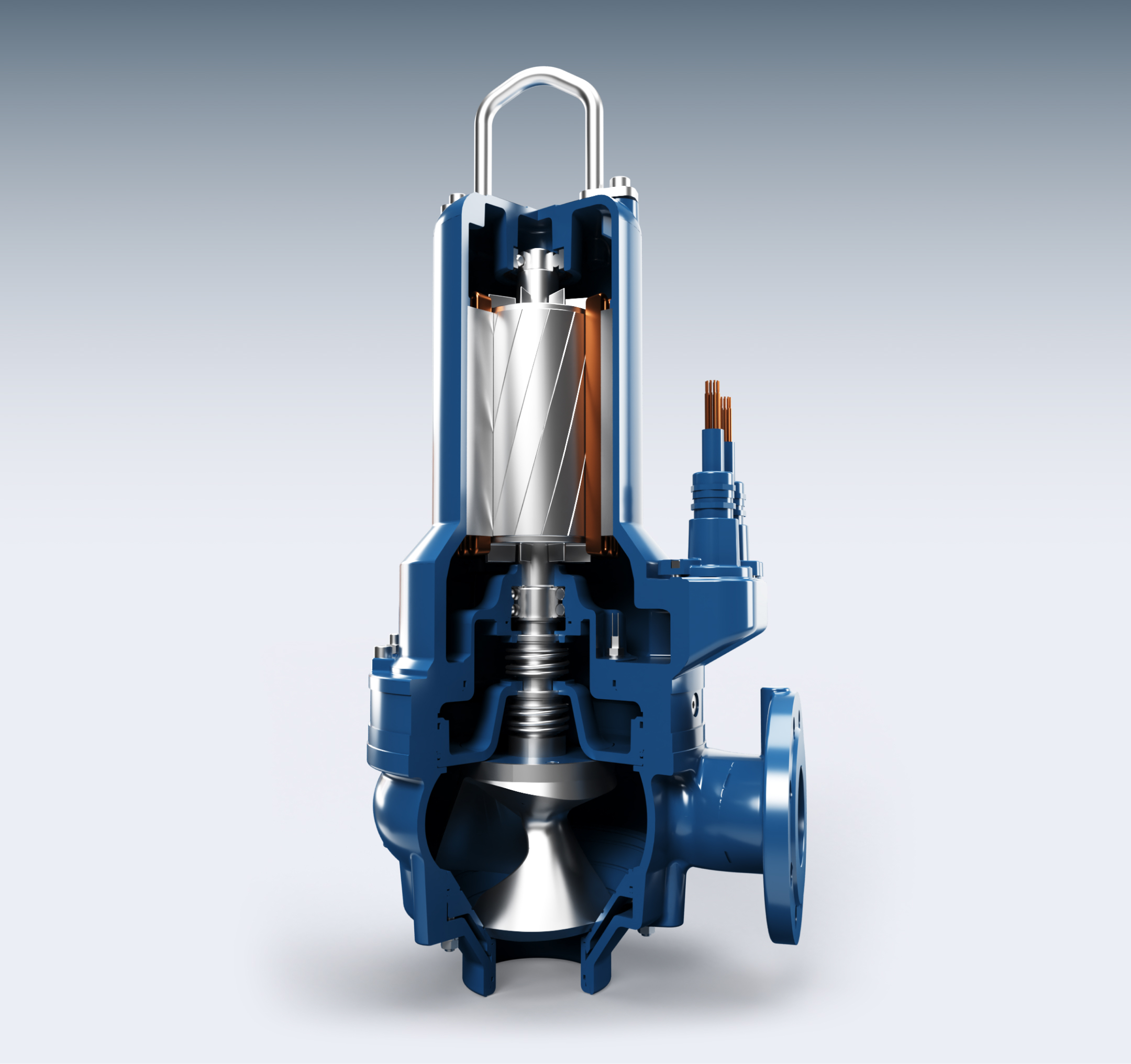
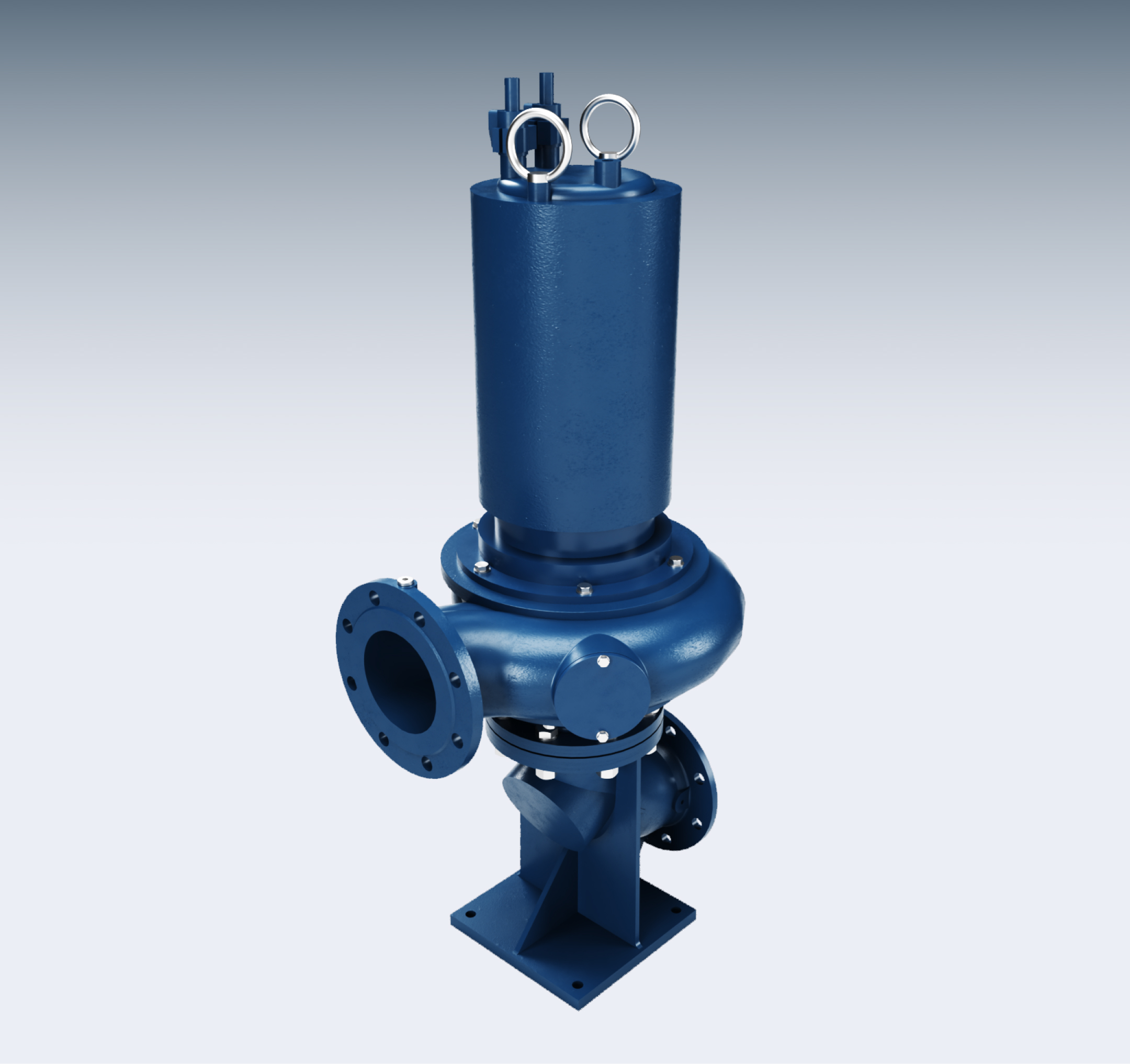
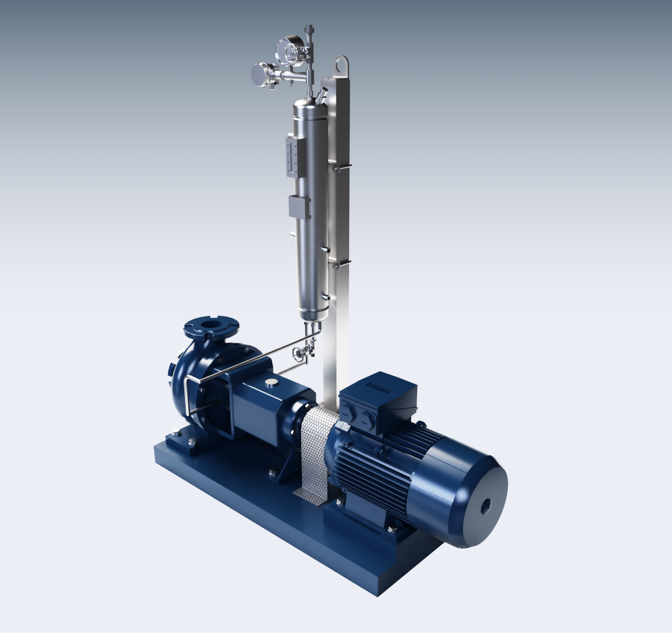
In the wastewater and sewage industry, beauty is rarely part of the conversation. The founders, however, approached it differently — while functional excellence remained the priority, they also placed strong importance on product design. We embraced this perspective and elevated it further through high-quality 3D renders and a sophisticated digital experience.

Built on strength
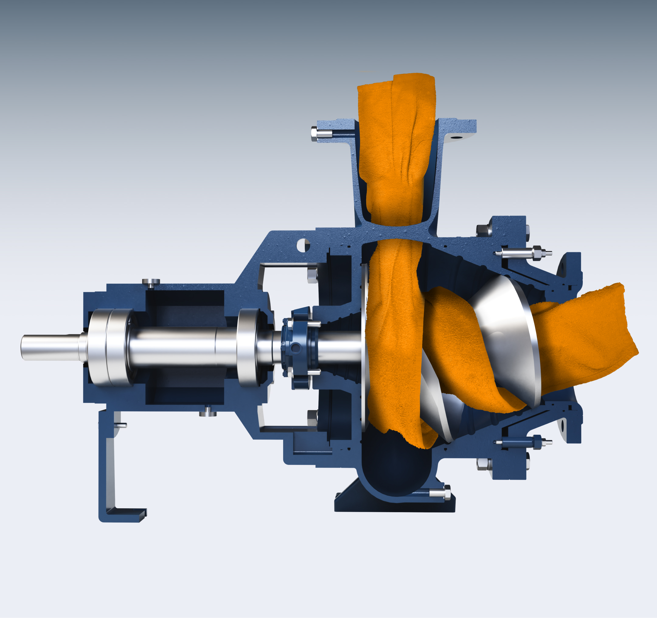
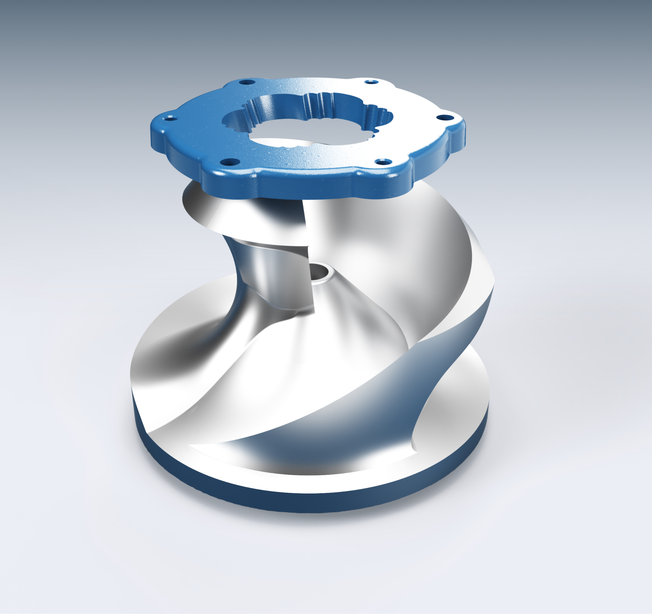
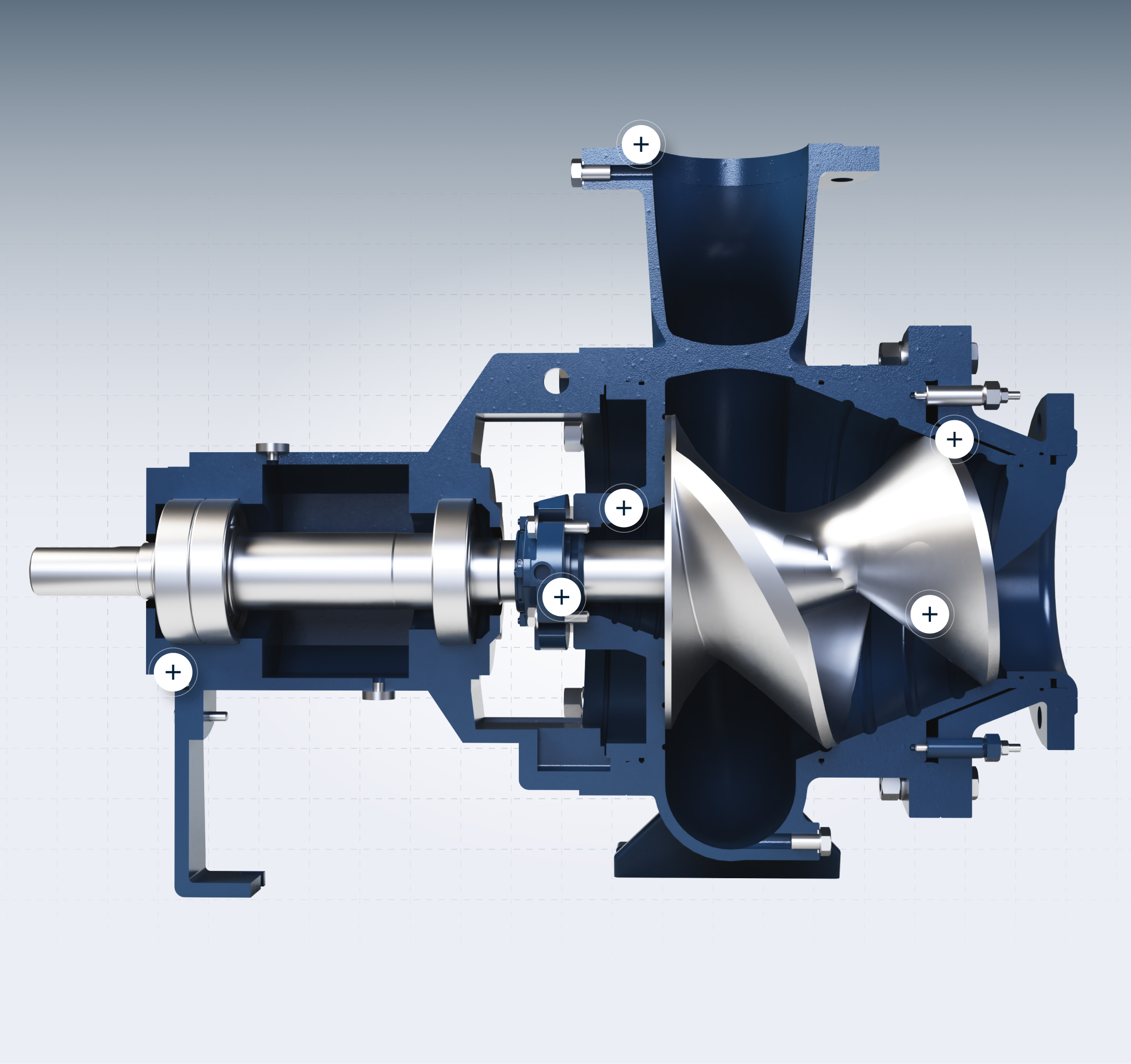
The branding was anchored in the pump’s defining feature — a single-blade, screw-shaped impeller. As the product’s core advantage, it combines high efficiency with the ability to pass large solids. Its strategic value, combined with strong visual potential, inspired the creation of the name, logo, and the entire brand identity.

Naming
The name SPIRAM was inspired by the pump’s spiral, screw-shaped impeller, derived from the Latin spira (spiral). By adding a simple brand suffix, we created a name that is clear, distinctive, and meets the criteria for international viability — from linguistic clarity and cultural neutrality to trademark potential.
Logo
The logo was designed as a combination mark — an icon paired with a wordmark. The icon reflects the pump’s screw-shaped impeller, while the name in a clear technical font ensures readability and professionalism. Together, they form a distinctive and versatile identity.

Design that turns engineering into experience

“We appreciate the craft of true engineering. By giving it a visual form, we honor the skills, knowledge, and heritage that it’s built on.”

Badge
The badge takes its form from the technical world, shaped like a nut — a symbol of strength, connection, and stability. At its core, an element of the Slovak national emblem ties the brand to its origin and values. Crafted to reflect both the industry and the company’s identity, the badge stands as a distinctive mark and a driver of trust.

Ready to elevate your brand to a world-class level?
Contact us for BRANDING or REBRANDING.
Brand Architecture
SPIRAM operates within a branded house architecture, where the master brand (SPIRAM) provides the foundation for all sub-brands and business lines. This includes SPIRAM Pumps, SPIRAM Sentinam, and SPIRAM Services, each clearly tied to the master brand while serving distinct functions.
For SPIRAM Technologies, we applied a complementary model of brand extension with descriptive sub-branding: product names such as Spiro-Gyra, Spiro-Guard, Spiro-Cut, and Spiro-Groove remain closely linked to the parent brand while carrying their own identity. This hybrid structure allows every segment to benefit from the strength of the master brand while enabling independent growth and future flexibility.


In B2B, a website is the company’s showcase — the first place partners and clients turn to evaluate credibility. The SPIRAM website was designed as a digital experience that builds both brand and trust. Since launch, it has been praised by partners, clients, and suppliers, and even attracted the first international distributors who discovered the company organically through its content and quality.
Visual system applied


Ready to start
your own project?
Contact us to schedule a free consultation and discuss your goals.
+421 (0) 915 200 811

Purpose
Trust
Approach
Contact
Work
B2B Marketing
B2B Design
Cookie policy
Privacy policy
© Manolo & Bay 2026